library(ggplot2) # general plotting purposes
library(emoji) # very important
library(dplyr) # data wrangling purposes
library(mgcv)
library(gratia)  # For GAM visualization helpers
library(readr) # for read_csv
library(knitr) # for pretti pretti tables
library(kableExtra) # also for pretti pretti tables
library(tidyverse) # more data wrangling
library(purrr)
A motivating example: climate change
Let’s suppose you’re tasked with studying global temperatures over as part of your thesis work. Let’s go ahead and begin our investigation by doing what should come naturally by now, plotting.
Load Real NOAA Climate Data
# 1. NOAA Global Temperature Anomalies
url <- "https://data.giss.nasa.gov/gistemp/tabledata_v4/GLB.Ts+dSST.csv"
temp <- read_csv(url, skip = 1, show_col_types = FALSE)
temp_data <- temp %>%
     select(Year, `J-D`) %>%
     rename(year = Year, temp_anomaly = `J-D`) %>%
     filter(!is.na(temp_anomaly))
# 2. NOAA Mauna Loa CO₂
co2_url <- "https://gml.noaa.gov/webdata/ccgg/trends/co2/co2_annmean_mlo.txt"
co2_data <- read.table(co2_url, skip = 57,
                       col.names = c("year", "co2_mean", "co2_unc"))

# 3. Merge datasets
climate_data <- inner_join(
  co2_data %>% select(year, co2_mean),
  temp_data,
  by = "year"
) %>% mutate(co2_mean = as.numeric(co2_mean),
             temp_anomaly = as.numeric(temp_anomaly))

# Show the data
head(climate_data)
## year co2_mean temp_anomaly
## 1 1971 326.32 -0.08
## 2 1972 327.46 0.01
## 3 1973 329.68 0.16
## 4 1974 330.19 -0.07
## 5 1975 331.13 -0.01
## 6 1976 332.03 -0.10The dataset
The dataset consists of observations of atmopsheric concetrations of CO$ _2 $ in parts per million (ppm) recorded at the Mauna Loa atmospheric research station in Mauna Loa Hawaii, USA. The dates of this specific subset of data range from 1971 to 2025. As an additional dimension you were gifted temperature data. They may look a little strange at first glance, but these are average annual temperature anomalies in degrees $ C $. Without further ado, let’s plot it.
ggplot(climate_data, aes(x = year, y = temp_anomaly)) +
  geom_point() +
  labs(x = "Year", y = "Temp Anomaly (C)") +
  labs(title = "Temp Anomalies vs Time",
       x = "Year",
       y = "Temp Anomaly (C)",
       caption = "Sources: NOAA/GML (Co2)")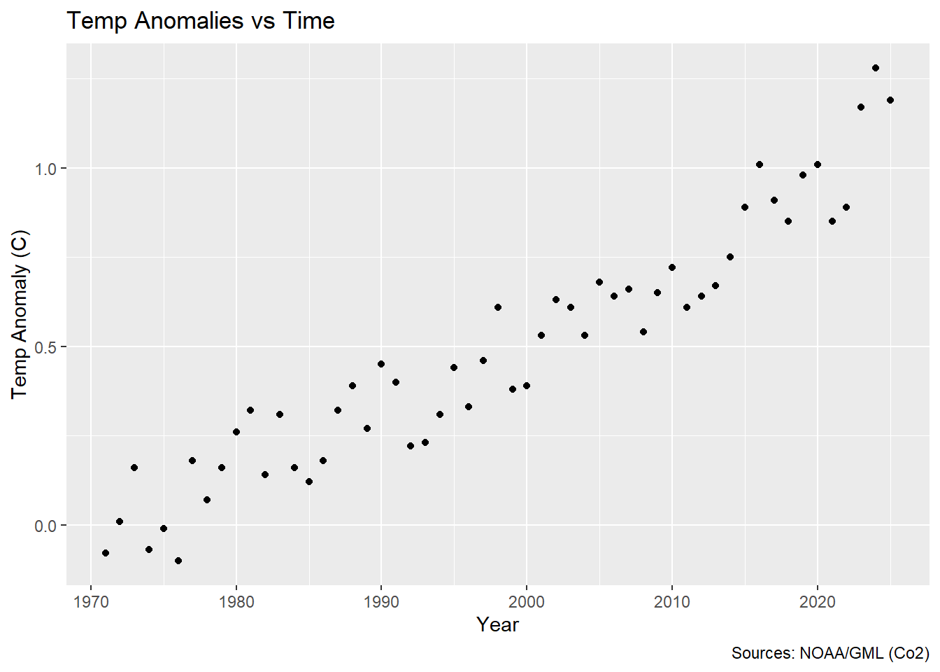
So looking at this, it might strike you that this doesn’t quite look like a linear relationship does it? So what is a researcher (tasked with the incredibly vague task of looking at temperature anomalies over time) to do upon seeing this 😂?! I’m glad you asked! Enter GAMs 🦸♀️!!
What is a GAM
If you were to do a quick Google search of what a GAM is you might be concerned to find that is actually early-mid 20th century Italian slang word for a leg (in fact, the Italian surname Gambucci means ‘little’ or ‘distinct’ leg). You might in fact fall down a rabbit hole and find out that the Gambino in Childlish Gambino is actually from a Wu-Tang Clan random name generator. But this blog post is not about random rap-name generators, legs, or Italian surnames but in fact about Generalized Additive Models (GAMs) (much more exciting right?)$ ^3$. GAMs let you model non-linear relationships without committing to a specific functional form (what I mean by functional form here is that you are not restricted to a linear, quadratic, cubic or any other ‘ic’ relationship). So instead of assuming \(y = \beta_0 + \beta_1 \cdot x\), you fit \(y = f(x)\), where \(f(\cdot)\) is a smooth function learned from the data (and not assumed a priori). GAMs give you flexibility with interpretability—you can see and understand the smooth functions. Because GAMs do not assume a functional form that they are sometimes called non- or semi-parametric.
Does a GAM really work better in this case 🤔?
The answer is yes. Yes it does. Here’s a plot showing it:
ggplot(climate_data, aes(x = year, y = temp_anomaly)) +
  geom_point() +
  geom_smooth(aes(color = "GAM smooth"), method = "gam", se = FALSE, formula = y ~ s(x)) +
  geom_smooth(aes(color = "Linear fit"), method = "lm", se = FALSE,  formula = y ~ x) +
  scale_color_manual(
    name = NULL,
    values = c("GAM smooth" = "blue", "Linear fit" = "red")
  ) +
  labs(x = "Year", y = "Temp Anomalies (C)") +
  labs(title = "Temp Anomalies vs Time",
       x = "Year",
       y = "Temp Anomalies (C)",
       caption = "Sources: NOAA/GML (Co2)") +
  theme_minimal()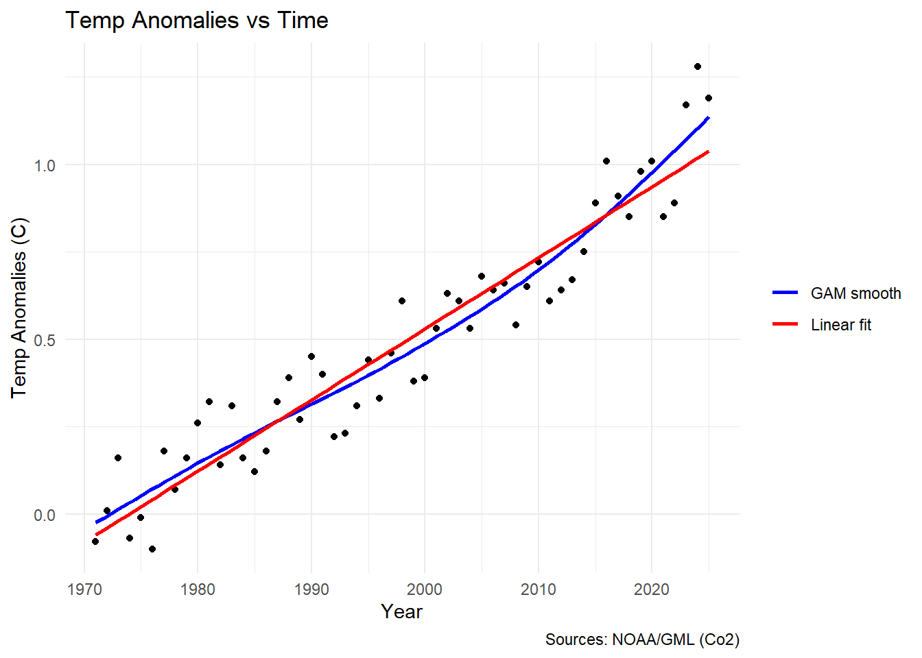
I’ll admit these data don’t look particularly wiggly at a glance, but we can
still see that the lm (red line) really doesn’t fit the data perfectly.
Don’t believe me? Well let’s look at it another way.
m_lm <- gam(temp_anomaly ~ year, data = climate_data, method = "REML")
m_gam <- gam(temp_anomaly ~ s(year, k = 10, bs = "cr"), data = climate_data, method = "REML")
# Build table
model_table <- data.frame(
  Model      = c("Linear", "GAM"),
  LogLik     = c(as.numeric(logLik(m_lm)),  as.numeric(logLik(m_gam))),
  Parameters = c(attr(logLik(m_lm), "df"),  attr(logLik(m_gam), "df")),
  AIC        = c(AIC(m_lm), AIC(m_gam))
)
# pretty table with kable
model_table |>
  kable(digits = 2,
        col.names = c("Model", "Log-Likelihood", "Parameters", "AIC")) |>
kable_styling(bootstrap_options = c("striped", "hover"))| Model | Log-Likelihood | Parameters | AIC |
|---|---|---|---|
| Linear | 46.41 | 3.00 | -86.81 |
| GAM | 52.03 | 5.64 | -92.79 |
So above I am comparing the models using Akaike’s Information Criterion (AIC). The long and short of AIC is that it compares the log likelihood of your model to the number of parameters it took to estimate that model (and penalizes you for using more parameters). We can see that the log likelihood is higher for our GAM and that AIC is much lower (which is better). This blog post is not about AIC (although I think that doing one on AIC would be useful), but it should be noted that AIC is not a perfect metric. The metric has caused some controversy due to it’s misue in Ecology specifically $ ^{4,5} $.
When we fit a GAM we do not actually get ‘parameters’ in the traditional sense. Instead we get something called effective degrees of freedom (edf). So it’s misleading for me to lump these both into a column called ‘parameters’. Unlike a linear model where the number of parameters is fixed and whole (for example in the parameters cell for linear model we have a estimated an intercept, slope and residual variance so we have 3 degrees of freedom used up), a GAM’s smooth is penalized toward simplicity during fitting. The EDF reflects how much flexibility (wiggliness) the smooth actually used — an EDF of 1 means the smooth collapsed to a straight line, while higher values indicate more ‘wiggliness’. It’s called “effective” because it’s not a count of literal parameters but a continuous measure of model complexity that the data and penalty jointly determine. Because GAMs do not have real ‘parameters’ calculating AIC actually uses EDF in their stead.
“Wiggly” data: what’s the basis?
I have mentioned that GAMs work by fitting wiggly lines to the data. I want to build some intuition on how this works. Underneath the hood, when we fit a GAM we are fitting what are called basis functions to the data. A basis function is essentially a simple “shape” that is fit to your data. The final “smooth” function is weighted by minimizing the residuals between the data and the basis function and the complexity (how wiggly that basis function is) by mgcv automatically. We can actually see this action with our own data by controlling a parameter called $ k $ (AKA the number of knots or basis functions used to fit the final smooth) in MGCV. Let’s see this in action by playing around with the $ k $ parameter.
# generate predictions for each knot (k)
preds <- map(c(2, 5, 10), function(k) {
  m <- gam(temp_anomaly ~ s(year, k = k, bs = "cr"), data = climate_data, method = "REML")
  tibble(
    year  = climate_data$year,
    temp   = fitted(m),
    k     = paste0("k = ", k)
  )
}) %>%
  bind_rows() %>%
  mutate(k = factor(k, levels = c("k = 2", "k = 5", "k = 10")))
# Plot
ggplot(climate_data, aes(x = year, y = temp_anomaly), alpha = 0.4) +
  geom_point() +
  geom_line(data = preds, aes(x = year, y = temp, color = k), linewidth = 0.8) +
  scale_color_viridis_d(name = "Model") +
  labs(x = "Year", x = "Temp Anomaly (C)") +
  theme_bw() +
  facet_wrap(~k)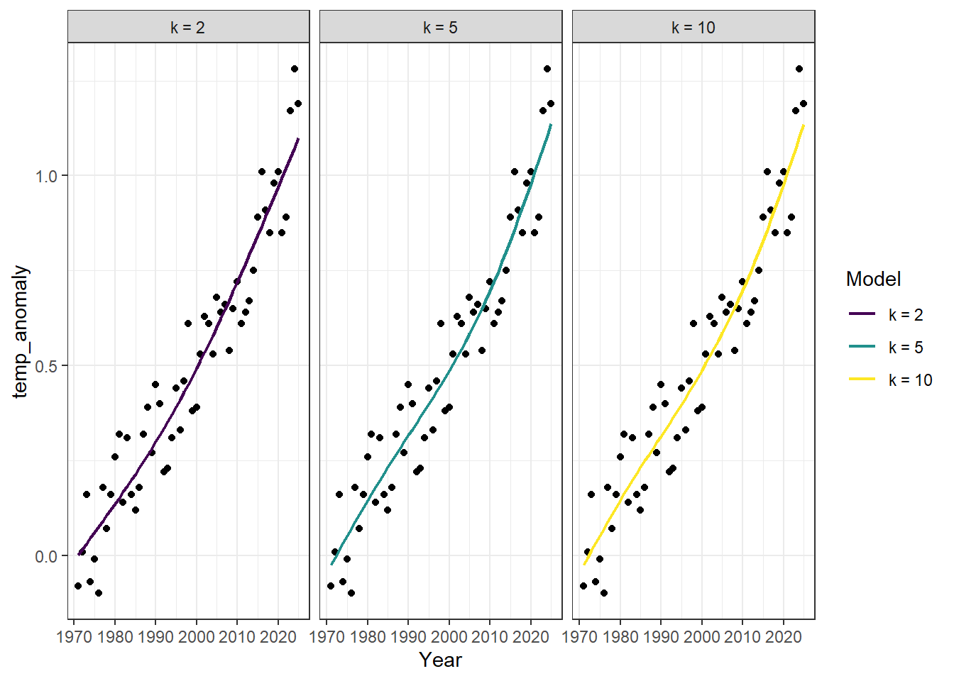
Note: By default $ k = 10 $. Also notice that I have introduced the parameter
bs. This stands for basis and is what we control to change the type of basis function that mgcv uses (essentially the type of basis determines the shape). The most important distinction is that some basis functions are ‘local’ (e.g.crwhich stands for cubic regression spline used above) whereas others are ‘global’ (e.g., the defaultbsparametertpwhich stands for thinplate). A local basis function takeskto be literal. It finds the ‘densest’ regions of data and assigns one of thekavailble knots to those dense parts and selects the locations ofkthat minimize the distance between the function and the data. A global spline (again like thetpoption) fitskbasis functions to the data. Each of those basis functions span the entire dataset. While both methods end up fittingkbasis functions thetpoption (for example) will fit an $ n x n $ matrix (where $ n $ is the number of datapoints) and select the topkof those functions. So computationally the global option is much more expensive for large datasets.
m7 <- gam(temp_anomaly ~ s(year, k = 7, bs = "cr"), data = climate_data, method = "REML")

# let's start by looking at the basic summary output
summary(m7)
##
## Family: gaussian
## Link function: identity
##
## Formula:
## temp_anomaly ~ s(year, k = 7, bs = "cr")
##
## Parametric coefficients:
## Estimate Std. Error t value Pr(>|t|)
## (Intercept) 0.48909 0.01316 37.17 <2e-16 ***
## ---
## Signif. codes: 0 '***' 0.001 '**' 0.01 '*' 0.05 '.' 0.1 ' ' 1
##
## Approximate significance of smooth terms:
## edf Ref.df F p-value
## s(year) 2.861 3.515 173.8 <2e-16 ***
## ---
## Signif. codes: 0 '***' 0.001 '**' 0.01 '*' 0.05 '.' 0.1 ' ' 1
##
## R-sq.(adj) = 0.919 Deviance explained = 92.3%
## -REML = -43.402 Scale est. = 0.009524 n = 55The key quantities to notice here are edf (again the effective degrees of freedom) and it’s associated p-value (note that this p-value does not have the same interpretation or formula as a p-value in a standard parameteric statistical test, but it does give some notion of the signficance of the shape of the relationship nonetheless). Remember that for this model we manually set $ k = 7 $. The fact that edf is not close to the $ k $ ceiling that we enforced (but still greater than 2) tells us two things. First, it is statistically true that the relationship between temp_anomaly and year is nonlinear. Second, the fact that edf is not close to \(k\) tells us that mgcv may have run out of ‘wiggly-ness’ to assign to the relationship. One thing you may notice is that unlike a typical model fit with lm (or some other parametric statistical model) we actually don’t get effect sizes here, meaning we get some information about the shape of the relationship between year and temp_anomaly but not any information about whether or not that relationship is positively or negatively related. To see whether the relationship is positive or negative we need to look at something called the partial effect. Also notice that the intercept in this case 0.49 is the average temp anomaly across the study years.
A partial effect is just the partial contribution of a predictor (i.e., year) to our response (i.e., temp_anomaly). Thankfully there are handy, programmable ways to see these partial effects clearly with a companion package to mgcv called gratia.
draw(m7)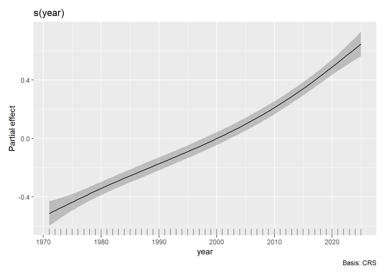
So this plotstill looks pretty smooth and linear (and also the confidence bounds are pretty small), but regardless we can interpret it. The partial effect of year on temperature anomalies is early in the time period and positive later in the time period. This is consistent with the general trend of global warming where global temperatures have been rising (relatively steadily) year over year since the dawn of the industrial revolution.
Another helpful function
One other thing to know in this basic gam writeup is the function gam.check(). Actually though gam.check() returns plots 🫥 so we can call it’s dependency k.check().
m2 <- gam(temp_anomaly ~ s(year, k = 2, bs = "cr"), data = climate_data, method = "REML")
m5 <- gam(temp_anomaly ~ s(year, k = 5, bs = "cr"), data = climate_data, method = "REML")
check_results <- map(list(m2, m5, m7), function(mod){
  k_check <- k.check(mod)
  tibble::tibble(
    k            = mod$smooth[[1]]$bs.dim,
    edf          = round(k_check[, "edf"], 2),
    k_index      = round(k_check[, "k-index"], 2),
    p_value      = round(k_check[, "p-value"], 2)
  )
}) %>% bind_rows()
# send it to a pretty kable table
check_results %>%
  kable(col.names = c("k", "EDF", "k-index", "p-value")) %>%
kable_styling(bootstrap_options = c("striped", "hover"))| k | EDF | k-index | p-value |
|---|---|---|---|
| 3 | 1.86 | 0.78 | 0.04 |
| 5 | 2.75 | 0.84 | 0.09 |
| 7 | 2.86 | 0.84 | 0.11 |
Looking at the table a pattern emerges. Between $ k = 3 $ and $ k = 5 $ the k-index essentially plateaus with very little additional information coming from $ k = 7 $. The k-index is a ratio of the difference between residuals that are close together in parameter space over what would be expected if the residual structure was totally random (i.e., white noise). In this sense it acts as a sort of $ R^2 $ where values closer to 1 are better (i.e., the neighboring residuals are what you’d expect from white noise so the model is doing its job). Or to put it another way, there is no structure to the residuals. A k-index less than 1 indicates that the numerator is smaller than the denominator (that there is structure to neighboring residuals leftover). So what this is telling us is that at $ k = 5 $ knots we are actually sufficiently wiggly to describe the relationship.
Multiple covariates
Quickly I would like to extend our model to include multiple covariates and demonstrate how to fit, plot, and interpret those effects.
m_multi <- gam(temp_anomaly ~ s(year, k = 7, bs = "cr") + s(co2_mean, k = 10, bs = "cr"),
               data = climate_data, method = "REML")

summary(m_multi)
##
## Family: gaussian
## Link function: identity
##
## Formula:
## temp_anomaly ~ s(year, k = 7, bs = "cr") + s(co2_mean, k = 10,
## bs = "cr")
##
## Parametric coefficients:
## Estimate Std. Error t value Pr(>|t|)
## (Intercept) 0.48909 0.01188 41.16 <2e-16 ***
## ---
## Signif. codes: 0 '***' 0.001 '**' 0.01 '*' 0.05 '.' 0.1 ' ' 1
##
## Approximate significance of smooth terms:
## edf Ref.df F p-value
## s(year) 3.925 4.84 2.002 0.09163 .
## s(co2_mean) 1.000 1.00 9.598 0.00322 **
## ---
## Signif. codes: 0 '***' 0.001 '**' 0.01 '*' 0.05 '.' 0.1 ' ' 1
##
## R-sq.(adj) = 0.934 Deviance explained = 94%
## -REML = -48.225 Scale est. = 0.0077663 n = 55Let’s notice a few things here. First, we get one line per smooth. So each smooth term gets it’s own edf and p-value (it’s own statistical estimation of the smoothness of the relationship between the predictor and the outcome). Second, notice that the edf for s(co2_mean) is 1. This means that we could adequately describe our relationship between CO$ _2 $ and temperature anomalies as a linear one.
Plot with gratia
gratia::draw(m_multi)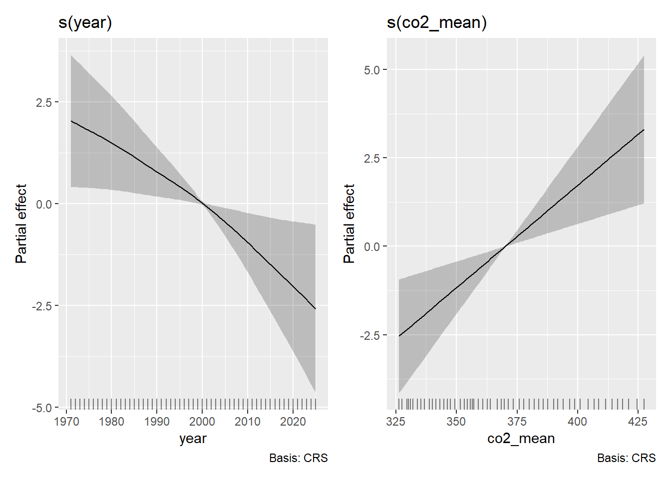
Notice that we get two side-by-side plots (one per smoothed term)…but these plots no longer seem so sensible. In fact, let’s check to see that this is the case by running a model with co2_mean and temp_anomaly.
m_co2_mean <- gam(temp_anomaly ~ s(co2_mean, bs = "cr"), data = climate_data)
gratia::draw(m_co2_mean)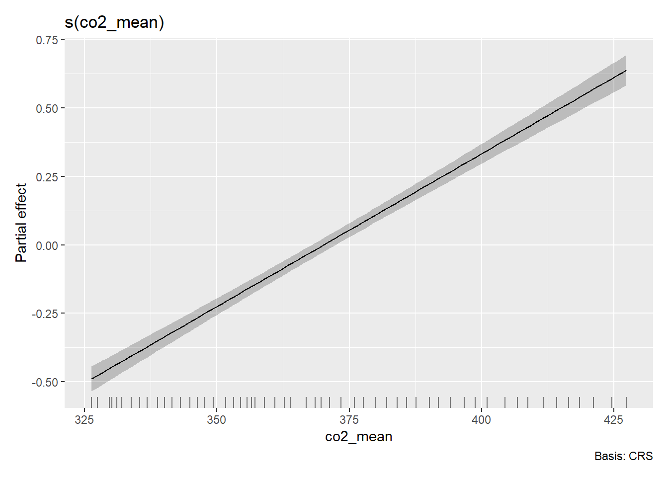
OK so something very funky is going on with the multi-variate GAM partial effects above…Thankfully, I have a pretty strong hunch about what’s going on. To confirm that hunch, let’s take a look at one more function.
mgcv::concurvity(m_multi)## para s(year) s(co2_mean)
## worst 1.843496e-28 0.9999336 0.9999336
## observed 1.843496e-28 0.9998354 0.9997859
## estimate 1.843496e-28 0.9978072 0.7275050The mgcv function concurvity measures the…well concurvity between two smoothed predictors. This is analogous to the idea of multicollinearity in parametric space, and what the output of the concurvity test is saying is…telling. Concurvity is a more generalized than that. It actually is a measure of how well s(year) can predict s(co2_mean) (and vice versa). So the first column is how well s(year) is predicted by s(co2_mean) and the second is how well s(co2_mean) is predicted by s(year). The rows correspond to the worst case (i.e., an upper limit on the concurvity), the observed case (based on the actual fitted values), and the estimate case (generally the most realistic and relevant). What we cansay is that all of these terms are highly concurve with one another and making it difficult to suss out true variation. In this case it would likely be wise to drop one of these covariates entirely.
Recap
Let’s bring it all together. Here’s what we covered:
What is a GAM?
Basis functions
Interpreting the output of a GAM from
mgcvChoosing $ k $
Multiple predictors
Concurvity
Further Reading
- The GAM Bible: Wood, S.N. (2017). Generalized Additive Models: An Introduction with R (2nd ed.)
- mgcv documentation:
?gamand package vignettes - gratia package: Modern ggplot2-based GAM visualization
- Noam Ross’s GAM course: Free online resource
Sources Cited
- Raupach, M. R., G. Marland, P. Ciais, C. Le Quéré, J. G. Canadell, G. Klepper, and C. B. Field. 2007. Global and regional drivers of accelerating CO2 emissions. Proceedings of the National Academy of Sciences 104:10288–10293.
- Needless reference to Childish Gambino
- Wood, S.N. (2011) Fast stable restricted maximum likelihood and marginal likelihood estimation of semiparametric generalized linear models. Journal of the Royal Statistical Society (B) 73(1):3-36
- Arnold, T. W. 2010. Uninformative Parameters and Model Selection Using Akaike’s Information Criterion. Journal of Wildlife Management 74:1175–1178.
- Sutherland, C., D. Hare, P. J. Johnson, D. W. Linden, R. A. Montgomery, and E. Droge. 2023. Practical advice on variable selection and reporting using Akaike information criterion. Proceedings of the Royal Society B: Biological Sciences 290:20231261.