Transforming response variables
Data transformations are often taught in introductory quantitative and statistics courses as methods for dealing with non-Gaussian (i.e., not normal) data, whether it be bounded (e.g, strictly positive) or skewed (https://ubco-biology.github.io/BIOL202/transform.html; https://ubco-biology.github.io/BIOL202/LSR.html#transform-the-data; Section 13.3 in Whitlock & Schluter 2020). In this post, I use simulated data to demonstrate issues that might arise with transforming data. I use a simulated dataset rather than an empirical one so we can compare the model results to the truth.
Imagine that a dangerous intersection has been causing frequent accidents between motored vehicles. A local group of concerned citizens decides to count the number of monthly accidents and report it to City Council. City Council decides to intervene by placing better street signs and lighting. The group of citizens then decided to count the number of accidents again to test whether or not there was an improvement in the number of accidents.
For the sake of this post, let’s assume that the mean number of accidents in the 12 months before the intervention was $\lambda_0=2$ per month. In the 12 months after the intervention, the mean number of monthly accidents decreases to $\lambda_1 = 0.4$. We can then simulate data for before and after the intervention as follows:
1
2
3
4
5
6
7
8
9
10
11
12
13
14
15
16
17
18
19
20
21
22
23
24
library('dplyr')   # for data wrangling
library('tidyr')   # for data wrangling
library('mgcv')    # for modeling
library('ggplot2') # for fancy plots
library('gratia')  # for diagnostic plots in ggplot

# change default ggplot theme
theme_set(theme_bw() +
            theme(panel.grid = element_blank(), legend.position = 'top',
                  text = element_text(face = 'bold')))

set.seed(2024+10+7) # for reproducible results
d <- expand_grid(month = 1:12,
                 period = factor(c('before', 'after'),
                                 levels = c('before', 'after'))) %>%
  mutate(lambda = if_else(period == 'before', true = 2, false = 0.4),
         accidents = rpois(n = n(), lambda = lambda))

ggplot(d) +
  facet_wrap(~ period, ncol = 1) +
  geom_histogram(aes(accidents), binwidth = 1, fill = 'grey',
                 color = 'black') +
  geom_vline(aes(xintercept = lambda), color = 'darkorange', lwd = 1) +
  labs(x = 'Accidents per month', y = 'Count')
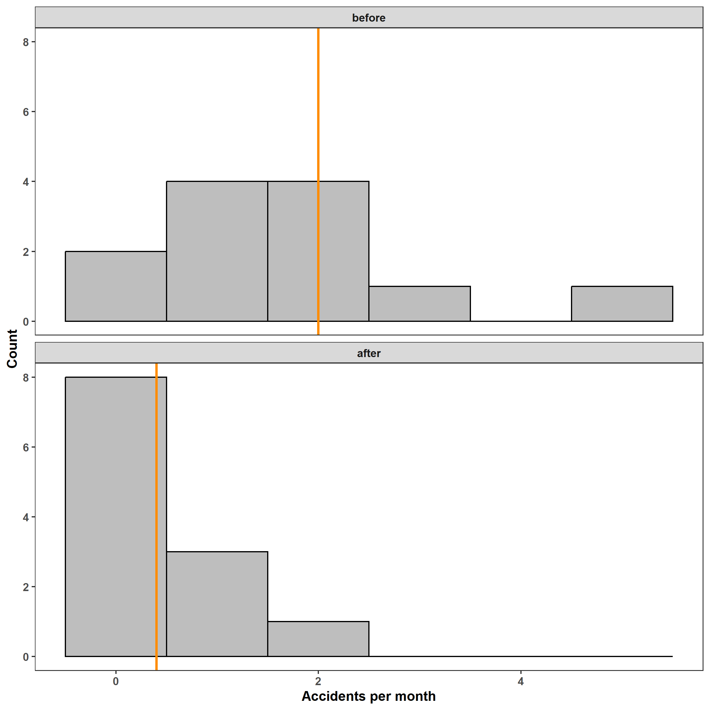
The distribution of the number of monthly accidents is clearly non-Gaussian both before and after the intervention. (Also note that the number of accidents cannot be negative.) Still, let’s fit a linear model to estimate the mean number of accidents in each period. In this post I use the mgcv::gam() function to fit all models for consistency and convenience, but note that you could also use the stats::lm() and stats::glm() functions, too. After fitting the model, we can look at the estimated change in mean accidents and appraise the model using diagnostic plots.
1
2
m_1 <- gam(accidents ~ period, data = d)
coef(m_1)
1
2
## (Intercept) periodafter
##    1.666667   -1.250000
From the output of the coef() function, we can see that the estimated model is \(Y = 1.67 - 1.25\,x_1,\) where $x_1$ is 0 for before the intervention and 1 for after. The periodafter coefficient indicates that there were -1.25 less accidents per month after the intervention. While this does not match the true effect of \(2 - 0.4 = 1.6\), we should expect some random variation, and the estimate is still reasonable. Longer observational periods would give us more accurate estimates.
1
appraise(m_1, point_alpha = 0.3)
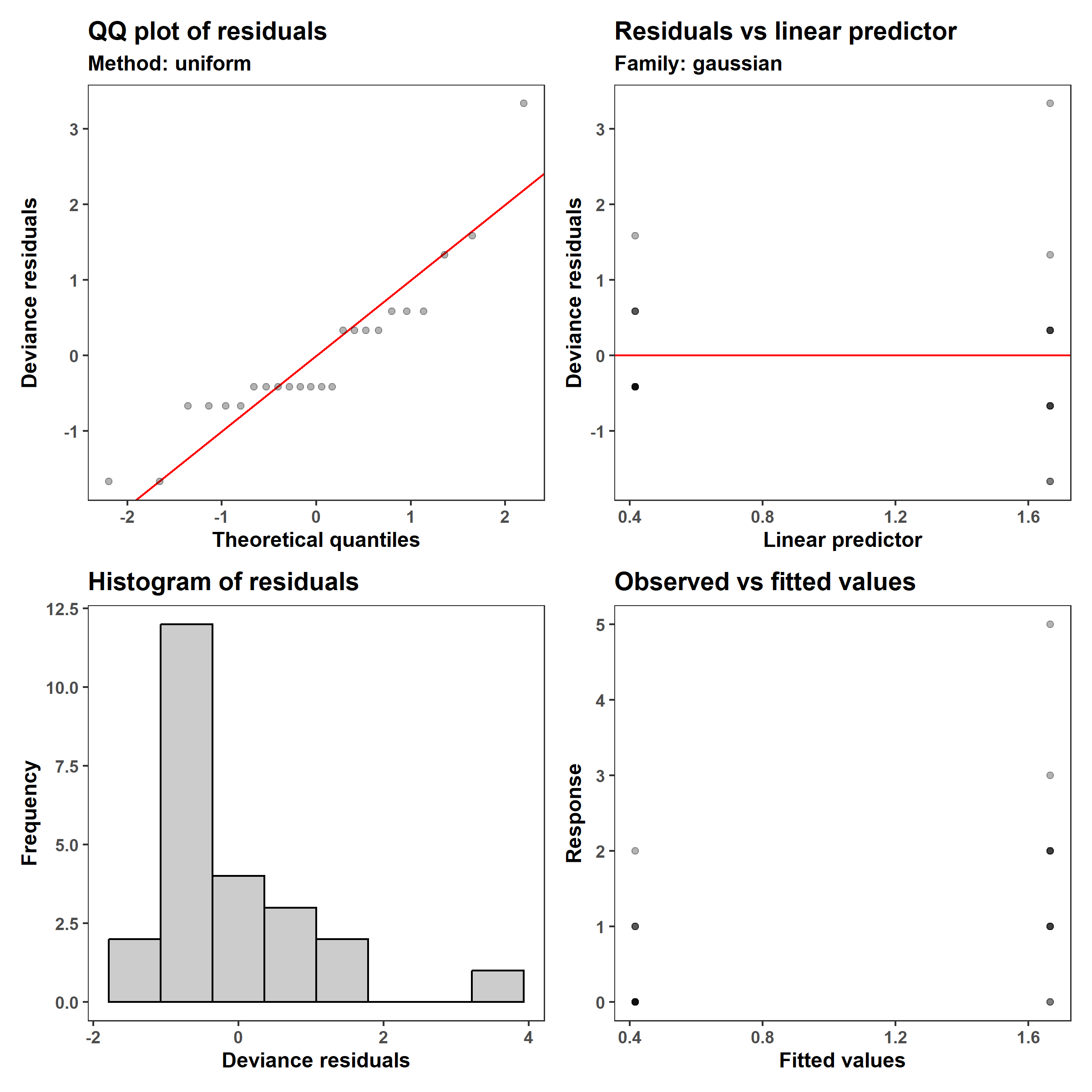
Those who are used to looking at these plots may recognize two issues: (1) the residuals are not Gaussian (see the q-q plot and the histogram, in the left column), and (2) the variance in the observed values is lower when the predicted mean (linear predictor and fitted values) is lower. One may then decide to log-transform the number of accidents, after adding a small value to avoid taking the log of zero (since $\log(0) = - \infty$).
1
2
3
4
# find proportion of months with no accidents
d %>%
  group_by(period) %>%
  summarize(prop_zero = mean(accidents == 0))
1
2
3
4
5
## # A tibble: 2 × 2
##   period prop_zero
##   <fct>      <dbl>
## 1 before     0.167
## 2 after      0.667
1
2
3
4
# add a variable of log(accidents + 1)
d$log1p_accidents <- log1p(d$accidents)
m_2 <- gam(log1p_accidents ~ period, data = d)
coef(m_2)
1
2
## (Intercept) periodafter
##   0.8620910  -0.5972532
1
appraise(m_2, point_alpha = 0.3)
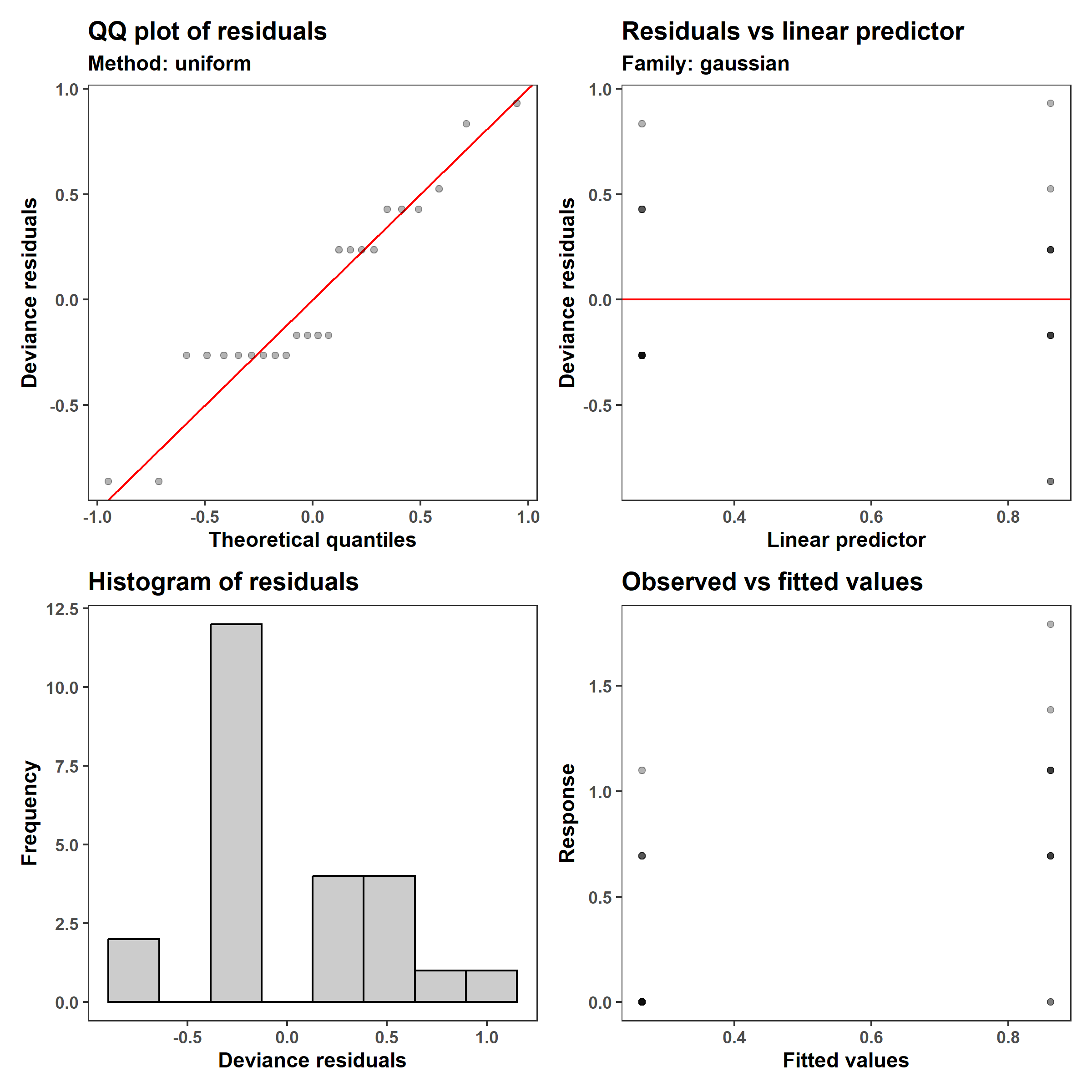
The log1p transformation resulted in a somewhat more symmetrical distribution of residuals, and the mode of the distribution is closer to zero, and improved the issue of non-constant variance (heteroskedasticity). The coefficients are also harder to interpret because they are on the log1p scale, since the model is \(\log(Y+1)=0.86 - 0.60 \,x_1\).
Rather than forcing our response variable to be Gaussian when it isn’t (see this modeling workshop I created with the CSC), we can fit a model that fits our data well: a Generalized Linear Model (GLM). GLMs allow one to recognize the structure of the response variable (e.g., any bounds and the mean-variance relationship) by specifying an appropriate statistical distribution (e.g., Gaussian, binomial, etc.).
The Poisson distribution is a good option because it represents the number of events that occur within a given period of time and location. We can fit a Poisson GLM by specifying the family in the gam() function:
1
2
m_3 <- gam(accidents ~ period, data = d, family = poisson(link = 'log'))
coef(m_3)
1
2
## (Intercept) periodafter
##   0.5108256  -1.3862944
1
appraise(m_3, point_alpha = 0.3)
The output from coef() tells us that the GLM is \(\lambda = e{0.51-1.39\,x_1}\). This means that after the intervention, the number of accidents decreased to $e^-1.39 * 100%= 0.25%$ what they were in the 12 months before.
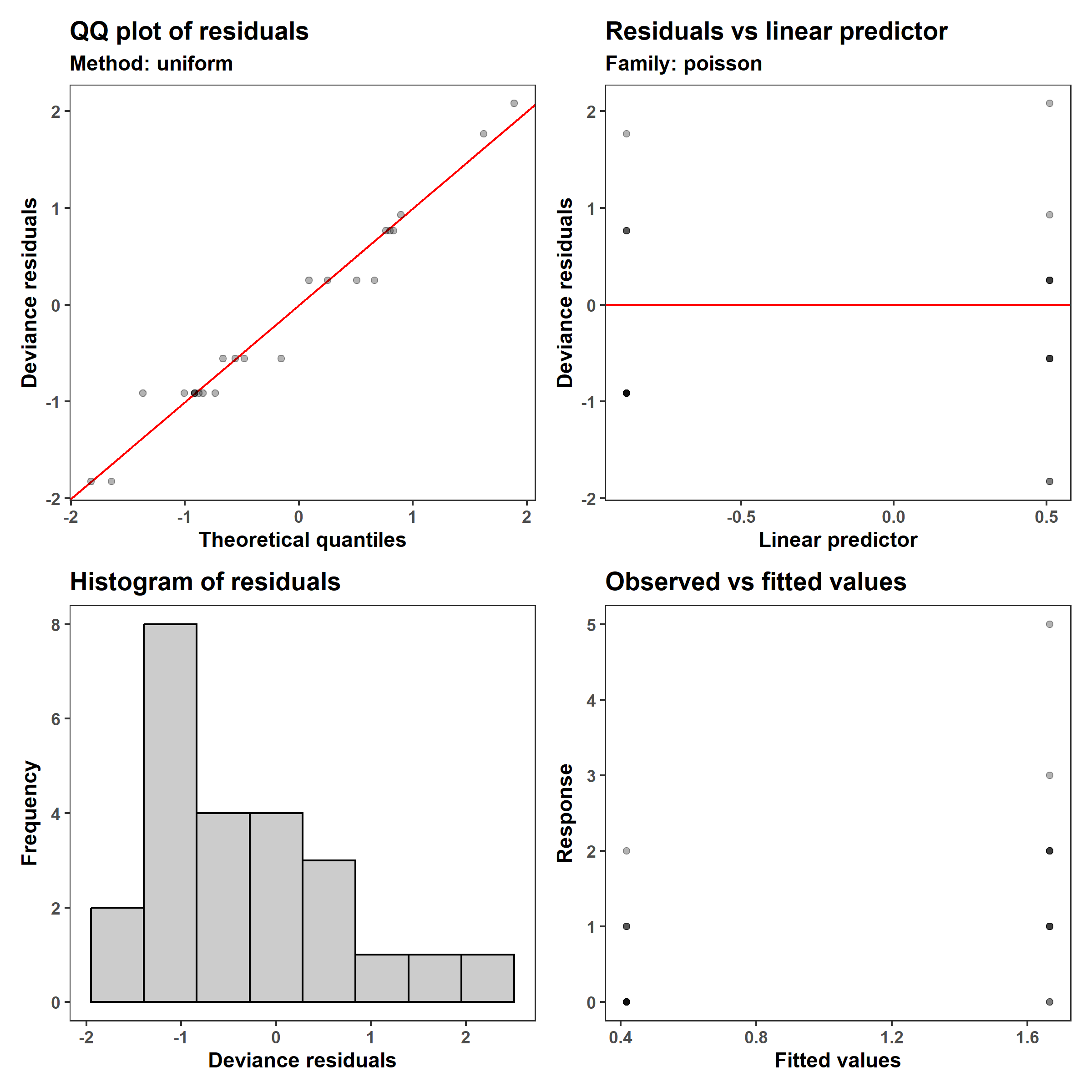
With the GLM, we can see a improvement in both the q-q plot and histogram of residuals, and while the variance still increases with the mean number of accidents, the model now expects that to be the case. This is because the variance of a Poisson distributions is equal to its mean, both of which are usually indicated as $\lambda$ rather than $\lambda$.
The $\log$ link function (link = 'log') allows us to create a model that will only give us non-negative numbers of accidents by having the form \(\log(\lambda) = 0.51-1.39 \, x_1,\) which we can re-write as \(\lambda = e^{ 0.51-1.39 \, x_1}\). Notice that while this model may look similar to the log1p model, the $\log$ function is applied to $\lambda$, the mean of $Y$, rather than to $Y$ directly. This is important because it removes the systematic bias that results from applying non-linear transformations such as $\log(Y)$, $\sqrt{Y}$, and $\arcsin\left(\sqrt{Y}\right)$ to a random variable. Now that we have three models, let’s compare between the predictions that the tree give us:
1
2
3
4
5
6
7
8
9
10
11
12
13
14
15
16
17
18
19
20
21
22
23
24
25
26
27
28
29
30
31
32
33
34
35
36
37
38
39
40
# predictions
pred <- function(model, model_type) {
  p <- predict(model, newdata = newdata, se.fit = TRUE) %>%
    as.data.frame()

  p <- p %>%
    transmute(
      model = model_type,
      # get predictions and approximate 95% Bayesian Credible Intervals
      est = case_when(model == 'LM' ~ fit,
                      grepl('log1p', model) ~ exp(fit) - 1,
                      model == 'Poisson GLM' ~ exp(fit)),
      lwr_95 = case_when(model == 'LM' ~ fit - 1.96 * se.fit,
                         grepl('log1p', model) ~ exp(fit - 1.96 * se.fit) - 1,
                         model == 'Poisson GLM' ~ exp(fit - 1.96 * se.fit)),
      upr_95 = case_when(model == 'LM' ~ fit + 1.96 * se.fit,
                         grepl('log1p', model) ~ exp(fit + 1.96 * se.fit) - 1,
                         model == 'Poisson GLM' ~ exp(fit + 1.96 * se.fit))) %>%
    bind_cols(newdata, .) %>%
    mutate(x = paste(period, model))
  p
}

newdata <- tibble(period = unique(d$period))
preds <-
  bind_rows(
    pred(model = m_1, model_type= 'LM'),
    pred(model = m_2, model_type= 'LM of log1p'),
    pred(model = m_3, model_type= 'Poisson GLM'))

ggplot() +
  facet_wrap(~ period, nrow = 1) +
  geom_hline(yintercept = 0, color = 'grey') +
  geom_hline(aes(yintercept = lambda), color = 'black', d, lty = 'dashed') +
  geom_jitter(aes('LM of log1p', accidents), d, alpha = 0.3, height = 0) +
  geom_errorbar(aes(model, ymin = lwr_95, ymax = upr_95,
                    color = model), preds, alpha = 0.3, width = 0) +
  geom_point(aes(model, est, color = model), preds) +
  labs(x = NULL, y = 'Number of accidents') +
  khroma::scale_color_highcontrast(name = 'Model')
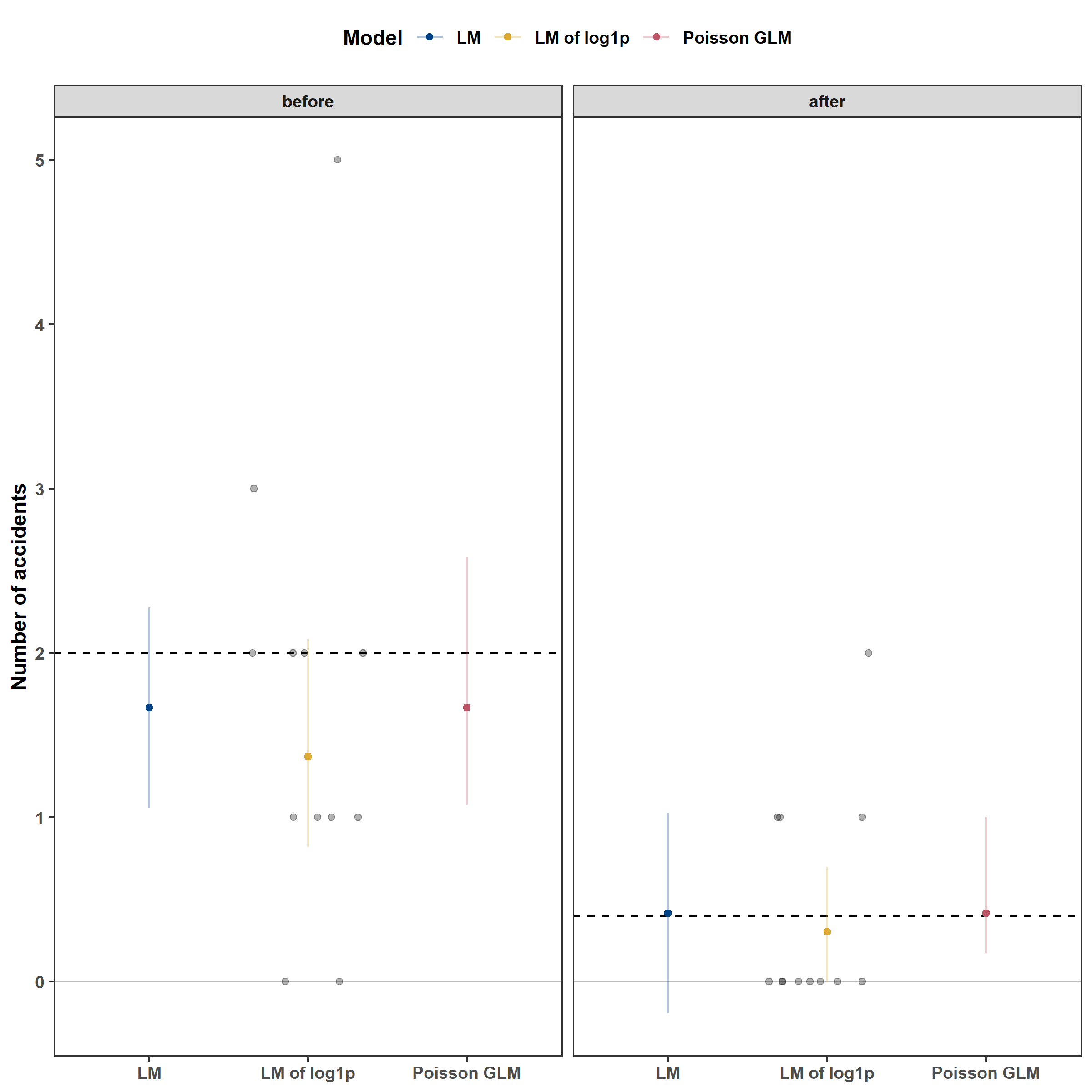
From the plot above, we can see that the LM and GLM have fairly similar coefficient estimates and that the log1p LM resulted in lower estimates for both. This is due to a systematic bias that occurs when one applies a nonlinear transformation to a random variable, like taking $$. I explain why in the sections below. Additionally, while the LM’s coefficients are reasonable, the 95% Bayesian Credible Intervals (BCIs) for the post-intervention estimate are not appropriate because they include negative values. In contrast, the GLM’s BCIs are asymmetric: they are shorter below the mean and longer above the mean. This is recognizes that a multiplicative change for large values is larger than one for small values: a 50% decrease will take 2 to 1 and take 4 to 2. Consequently, asymmetric BCIs provide a better representation of the model’s uncertainty.
Linear and nonlinear transformations
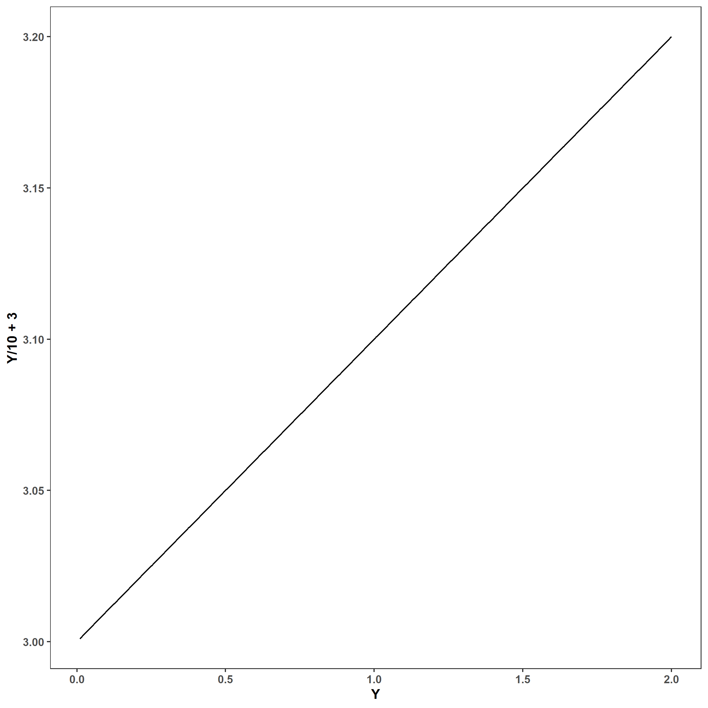
I want to end this section by explaining the difference between linear and nonlinear transformations and how the two impact modeling. Linear transformations include all transformations that can be written as a series of additions, subtractions, multiplications, or divisions. Formally, they have the form $Y^* = (aY + b)$, where $Y$ is our original response variable of interest, $a$ and $b$ are any number (but $a \ne 0$), and $Y$* is the transformed response. These transformations are called “linear” because the operations of addition, subtraction, multiplication and division only shift distributions left and right (addition and subtraction) or expand and shrink distributions (multiplication and division), so $Y$* and $Y$ follow a linear relationship for any finite and nonzero value of $a$ and any finite value of $b$:
1
2
Y <- seq(0.01, 2, by = 1e-3)
ggplot() + geom_line(aes(Y, Y/10 + 3))
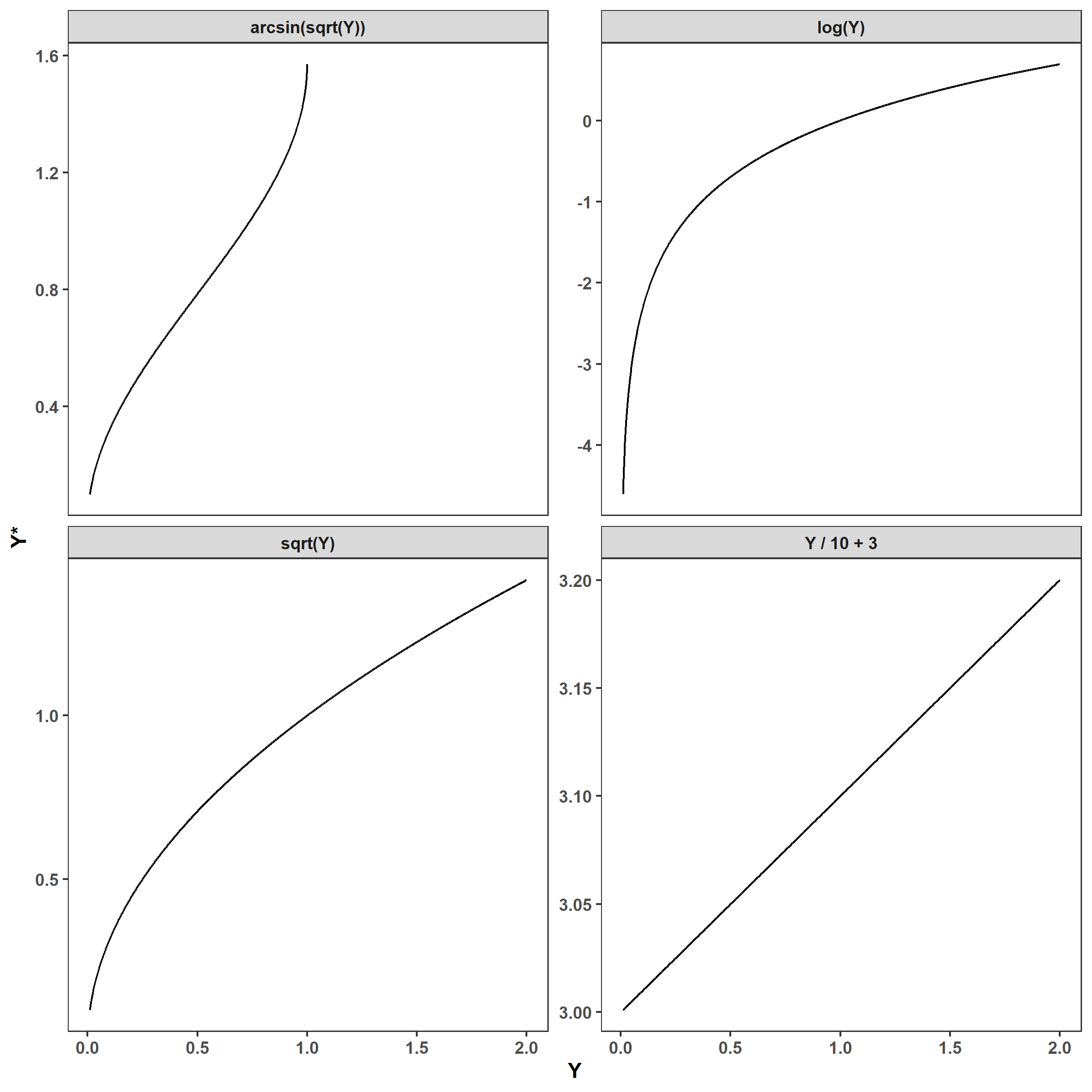
Conversely, nonlinear transformations are all transformations that cannot be written using only addition, subtraction, multiplications, or division. If we were to plot any of these functions, we would see a nonlinear relationship between the original and transformed values:
1
2
3
4
5
6
7
8
9
10
11
12
expand_grid(Y = Y,
            trans = c('Y / 10 + 3', 'log(Y)', 'sqrt(Y)',
                      'arcsin(sqrt(Y))')) %>%
  mutate(
    Y_star = case_when(trans == 'Y / 10 + 3' ~ Y/10 + 3,
                       trans == 'log(Y)' ~ log(Y),
                       trans == 'sqrt(Y)' ~ sqrt(Y),
                       trans == 'arcsin(sqrt(Y))' ~ asin(sqrt(Y)))) %>%
  ggplot(aes(Y, Y_star)) +
  facet_wrap(~ trans, scales = 'free_y') +
  geom_line() +
  labs(x = 'Y', y = 'Y*')
1
2
3
4
## Warning: There was 1 warning in `mutate()`.
## ℹ In argument: `Y_star = case_when(...)`.
## Caused by warning in `asin()`:
## ! NaNs produced
Jensen’s inequality
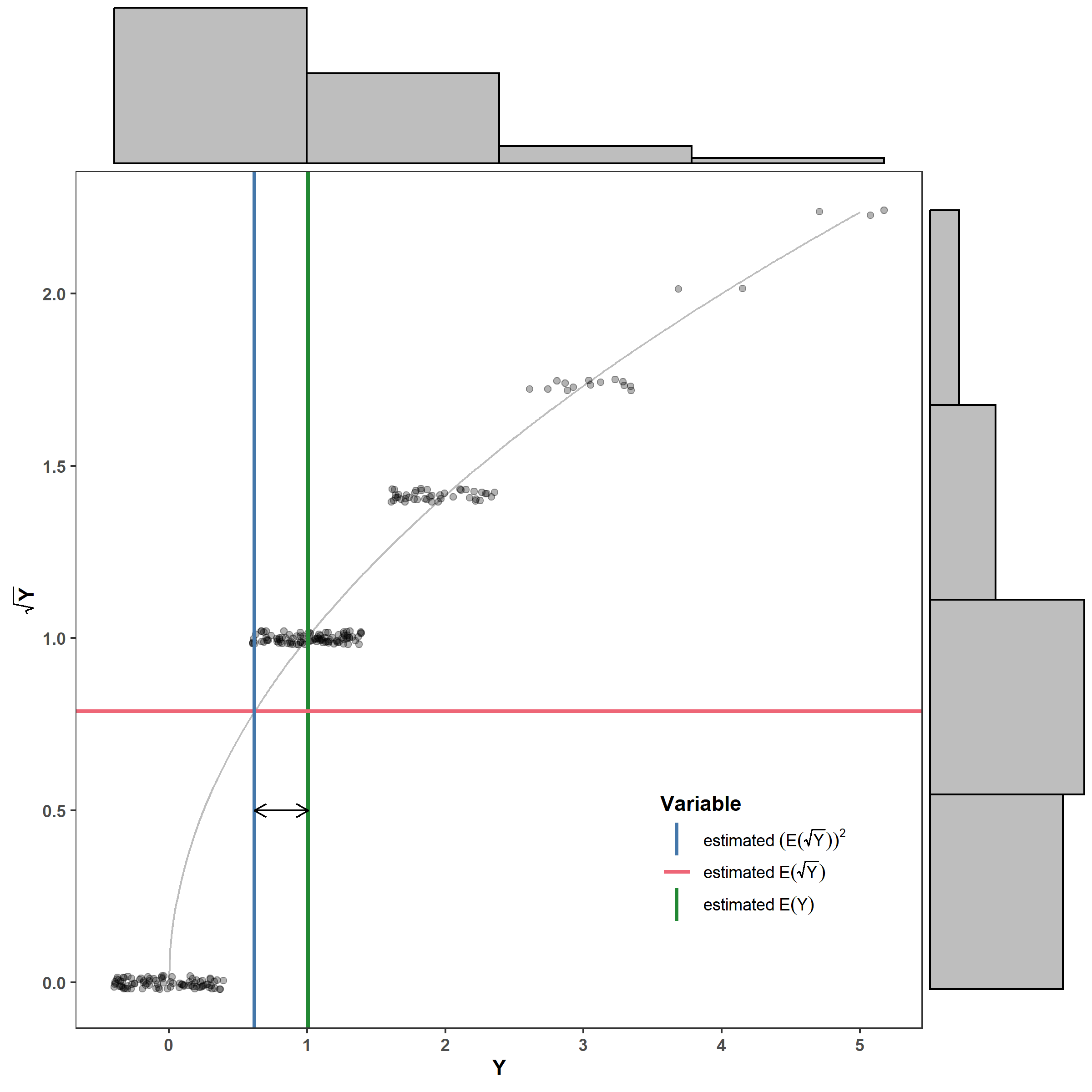
Jensen’s inequality demonstrates that if we apply a nonlinear transformation to a random variable, we can’t simply back-transform the mean. This is because, if $g()$ is a nonlinear transformation and $g^{-1}()$ is its inverse (e.g, $g() = \log()$ and $g^{-1}()=\exp()$): \(g\big[\mathbb E(Y)\big] \ne \mathbb E\big[g(Y)\big],\) where $\mathbb E()$ indicates an expected value such that $\mathbb E(Y)=\mu$. This implies that \(\mathbb E(Y) = \mu \ne g^{-1}\bigg\{\mathbb E\big[g(Y)\big]\bigg\}\).
Here is a graphical example to help you visualize why. The green vertical line is the estimated mean (i.e., what we’re usually interested in), the red line is the estimated mean of the square-root transformed $Y$, and the blue line is the back-transformed estimated mean of the square-root transformed $Y$. The black line is the estimated bias.
1
2
3
4
5
6
7
8
9
10
11
12
13
14
15
16
17
18
19
20
21
22
23
24
set.seed(2024-10-7)
Y <- rpois(n = 250, lambda = 1)

ggExtra::ggMarginal(
  ggplot() +
    geom_line(aes(seq(0, ceiling(max(Y)), by = 0.01),
                  y = sqrt(after_stat(x))),
              color = 'grey') +
    geom_jitter(aes(Y, sqrt(Y)), height = 0.02, alpha = 0.3) +
    geom_vline(aes(color = 'estimated~E(Y)', xintercept = mean(Y)),
               lwd = 1) +
    geom_hline(aes(color = 'estimated~E(sqrt(Y))',
                   yintercept = mean(sqrt(Y))), lwd = 1) +
    geom_vline(aes(color = 'estimated~(E(sqrt(Y)))^2',
                   xintercept = mean(sqrt(Y))^2), lwd = 1) +
    geom_segment(aes(x = mean(sqrt(Y))^2, xend = mean(Y), y = 0.5, yend = 0.5),
                 arrow = grid::arrow(ends = 'both', length = unit(0.1, 'in'))) +
    labs(x = 'Y', y = expression(bold(sqrt(Y)))) +
    khroma::scale_color_bright(name = 'Variable',
                               labels = scales::parse_format()) +
    theme(legend.position = 'inside', legend.position.inside = c(0.8, 0.2),
          legend.frame = element_rect(fill = 'black')),
  fill = 'grey', type = 'histogram', xparams = list(bins = 5),
  yparams = list(bins = 5))
However, note that the transformations only cause bias if applied to random variables. You can apply nonlinear transformations to predictor variables that you assume are measured exactly right. This means that fitting a model of the form $Y = \beta_0 + \beta_1 \log(x_1)$ will not cause issues if you assume $x_1$ is exactly correct with no error (as we often assume). Applying nonlinear transformations on predictors can be useful when a predictor has a distribution with a very long tail, or if one wants to create a variable with diminishing effects (e.g., moving closer to something matters more when you’re close and less when you’re already far from it). I will make a blog post on this in the future.
References
Whitlock M. & Schluter D. (2020). Analysis of biological data, Third edition. Macmillan Learning, New York, NY.
