Writing a thesis or paper introduction? Don’t just say your field is growing or that your topic is becoming important—show it. With a a few lines of R, you can create compelling visualizations that demonstrate trends in your field and precisely why what you’re talking about is important.
Here’s how to go from search results to publication trend plots in about 5 minutes.
Here are the packages you will need to actually run this.
|
|
Above the dplyr package is great for data wrangling and cleaning datam, openAlexR allows us to easily legally scrape the web for scientific journals, and of course ggplot2 helps us make things pretty. Most importantly I just (at the time of writing this) found an R package called Rmoji 🔥.
In this example I’m particularly interested in seeing what trends there are in predictive ecology. The metric I’m using to measure the change in predictive ecology is to look at annual trends in the number of publications that feature key terms in the abstract or the title.
|
|
In the above example we’re querying open Alex’s servers using the openAlexR function oa_fetch. The works parameter specifies what type of object we’re querying open Alex for. We specified works meaning we’re looking for papers. The next parameter is title.search which tells oa_fetch that we want to get papers that contain “prediction”, “predict”, or “forecasting” in the title. Like title.search abstract.search tells oa_fetch that we want to search for the the keywords specified after the ‘=’ sign. concepts.id allows us to specify a specific domain (note that C86803240 is for the entire domain of Ecology). To get a list of all the concepts check this webpage out. Of course we want to specify date ranges for that (the next two parameters). The last parameter tells oa_fetch to randomly sample 100 of those works that come up and I set the seed for reproducibility.
|
|
Above we did a little data cleaning with dplyr just to make the columns a little prettier and also make sure that all of our works did actually contain a year (since we’re interested in looking at annual trends).
|
|
Speaking of annual trends here we actually summarise the number of publications by year.
|
|
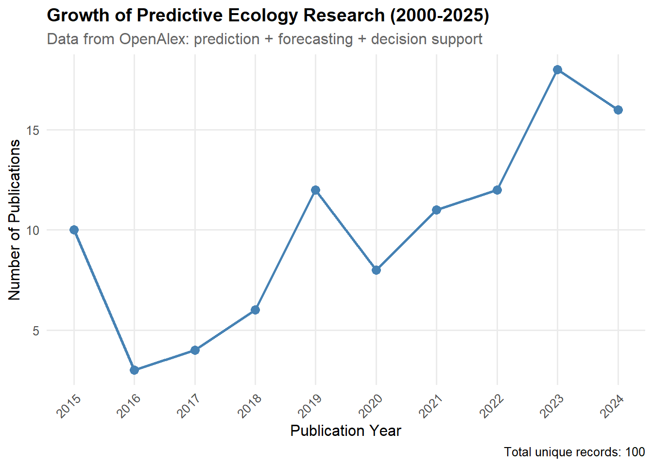 So great! We've done it. We've created a cool chart showing how important orecasting and decision support are becoming in Ecology with just a few lines of code. How about that to knock the socks off your advisor for your research proposal 🐱.